DESIGN PRINCIPLES YOU MUST USE TO HELP TRANSFORM YOUR HOME

Design Principles

If you’ve ever looked through home decor magazines, social media, or even been to a friend’s home and thought to yourself, “There’s something here that I can tell a designer has been here”, and you’ve wondered what the difference is between doing it yourself and getting a designer look, you’re in luck because today, I’m going to share with you some of the rules you need to use to get that look in your own home.

Let me first start by saying that it is not the amount of money spent that makes the difference, and to prove this, head over to TikTok, Houzz, or any of the other social media platforms and you’ll notice that there are tons of creators out there that are not professional designers, and yet they are creating beautiful, professional looking spaces.

The reason for this is simple; they are following the rules; whether they know it or not, they are intuitively following the five elements that help make a room more beautiful. So today, we’re going to break down what those elements are and I’m going to do it in a way that will make it easy for you to understand.

Let’s start with the first rule, balance, which is the foundation of any well-designed room. Balance can be achieved in three ways: symmetrical, asymmetrical, and radial. Symmetrical balance involves mirroring one side of the room with the other, while asymmetrical balance creates balance through weight. Radial balance radiates furniture out from the centre point of the room, creating a balanced look that draws the eye towards the centre of the space.

Color is another important component of balance. Using the 60-30-10 rule, you can achieve a harmonious color scheme in your room. This rule means that 60% of your color should be your primary choice, 30% should be a secondary color, and 10% should be an accent color. Remember to consider the color of your floors, walls, and furniture when creating your color scheme.

The next principle of interior design is rhythm. Rhythm creates visual interest by repeating color, texture, shape, and pattern throughout the room. This repetition keeps the eye moving around the space and unifies different elements of the room. You can create rhythm in your room by using archways, repeating color from a piece of art in your pillows or area rug, or using accessories that vary in size or pattern.

Contrast is another important element of interior design. Without contrast, a room can feel flat and uninteresting. Contrast adds excitement and interest to a space by creating a balance between opposing elements like large and small, dark and light, round and straight or angular, and smooth and textured.

Finally, proportion and scale are essential for creating a comfortable and inviting space. Proportion refers to how well the furniture fits into the size of the room, while scale is how the furniture relates to other pieces in the room. Using the golden ratio, which suggest that your sofa should be two-thirds the size of your wall, your art and coffee table should be two-thirds the size of your sofa, etc, can help ensure that your furniture is the right size for your space. Additionally, consider the height of your ceiling and the size of your room when choosing furniture and decor for your room.

By keeping these five principles of interior design in mind, you can create a space that is balanced, visually interesting, and comfortable. Whether you’re a professional designer, or just an avid, design-loving home owner, these principles are essential for creating a beautiful home.

click here to watch the full YouTube video.

Family Room

Family Room Design Rules

The family room is one of the hardest working, most important spaces in a home; for most of us, it’s where families gather to spend quality time together, whether it’s sharing a pizza or snack while watching our favourite TV show, spending quiet time reading a book, playing a game of chess or checkers, or entertaining extended family friends. Therefore, it's crucial to design a space that is comfortable, functional, as well aesthetically pleasing. This month we take a look at some of the key components to take into account in order to achieve a space that is comfortable, inviting and most importantly, a functional space.

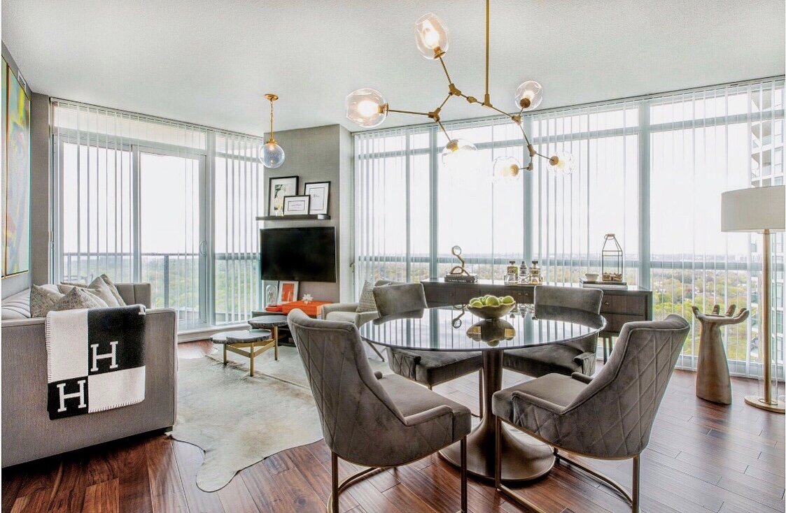
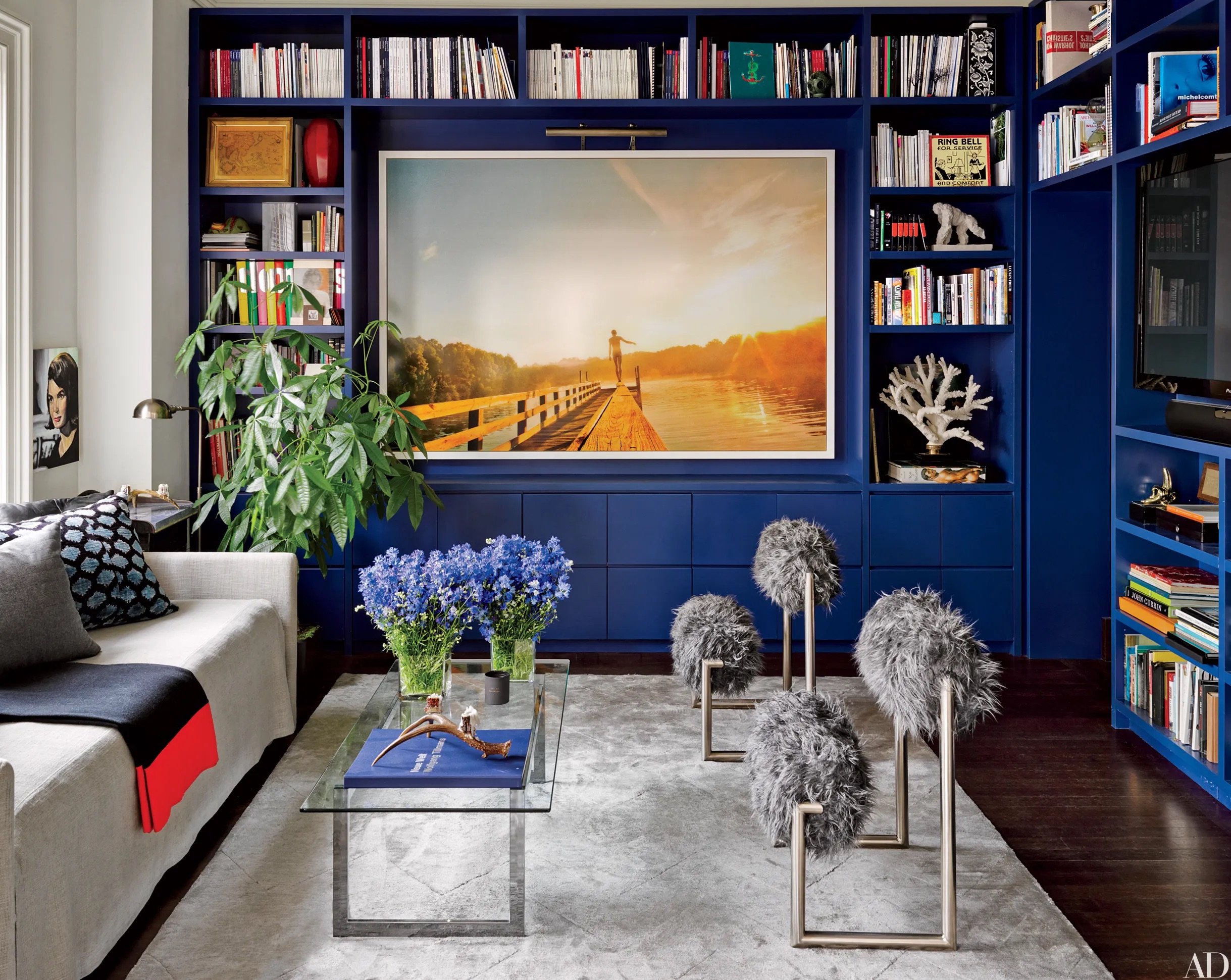
The first step in designing the perfect family room is to determine its function. While some families may use the space for conversation, the majority of family rooms are designed for TV watching. As such, it's important to make the TV the focal point of the room. Placing the TV over the fireplace, (another major focal point in most family rooms) is a common mistake, as it can be uncomfortable for extended viewing periods. The optimal height for the center of the TV is 54 inches above the finished floor, providing a comfortable viewing experience that doesn't put strain on your neck. When determining the best size TV for your room, multiply the size by 1.5 to 2.5 times to get the optimal viewing distance from sofa to screen.

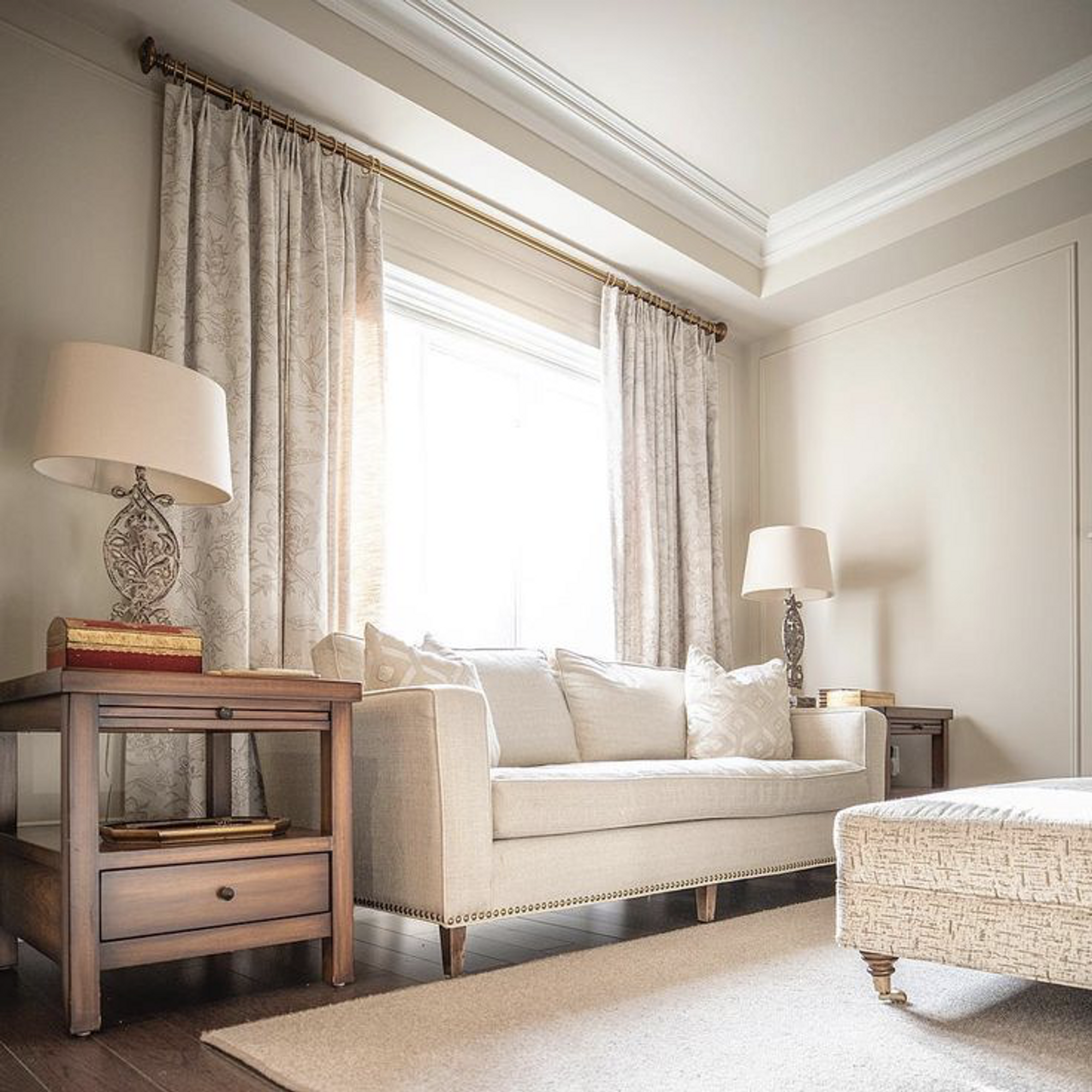
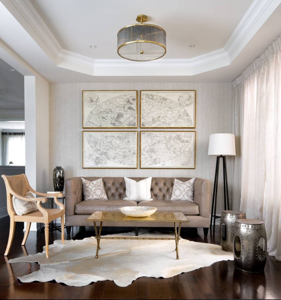
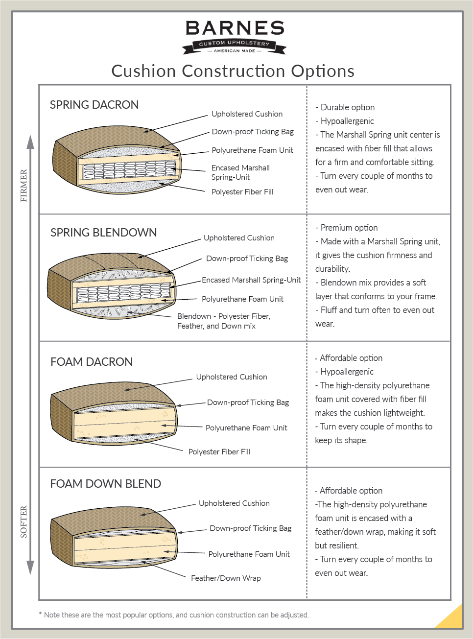
Comfortable seating is also crucial for enjoying your TV viewing experience. Ideally, you should have a sofa directly across from the TV, rather than two sofas facing each other. This ensures that you don't have to contort your body to watch the TV, which can be uncomfortable for longer viewing sessions. High-backed armchairs are also a great option for additional seating. It's important to choose a properly sized, good-quality sofa that fits the space and your personal style. Try sitting on different sofa stuffings to determine what feels best for you and your family. Foams come in different densities for a harder or softer sit, while an ‘down-filled envelope cushion’ is the ultimate sit experience but does come at a premium price.

Lighting is a critical factor in creating the right ambiance in your family room. Incorporating both ambient and overhead lighting is ideal, with lamps placed near seating areas to create a more relaxing environment. Art lights can also provide a bit of ambiance without being too distracting. Cabinet lighting is a great way to bring ambience to the room as well as highlight treasured heirlooms and books. Remember to use a warmer lightbulb for a more relaxing and inviting space.

The size of your carpet is another essential consideration for your family room. It's best to choose a large carpet that will accommodate all of your furniture. This will not only make the room feel more spacious but also tie everything together.

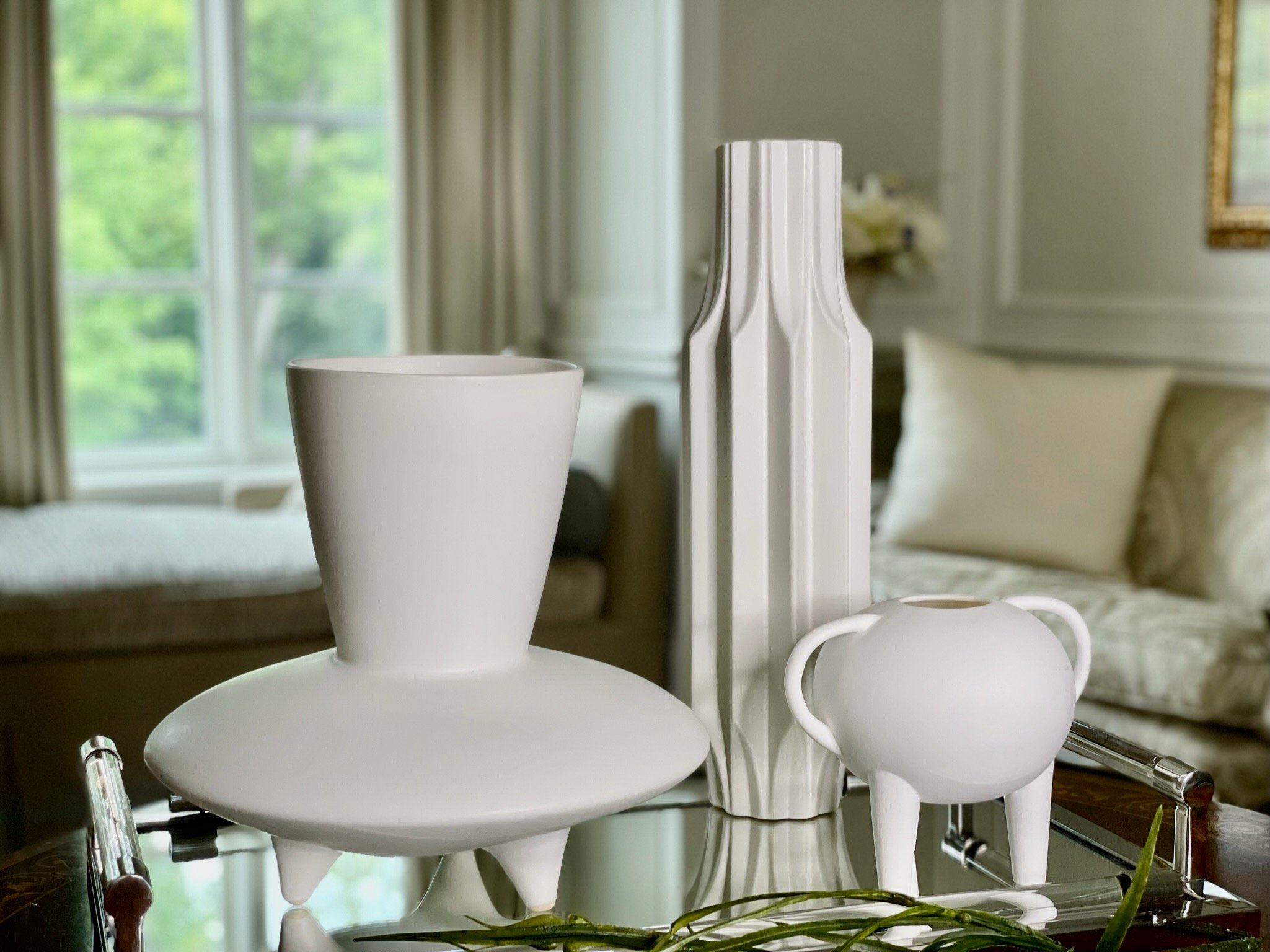
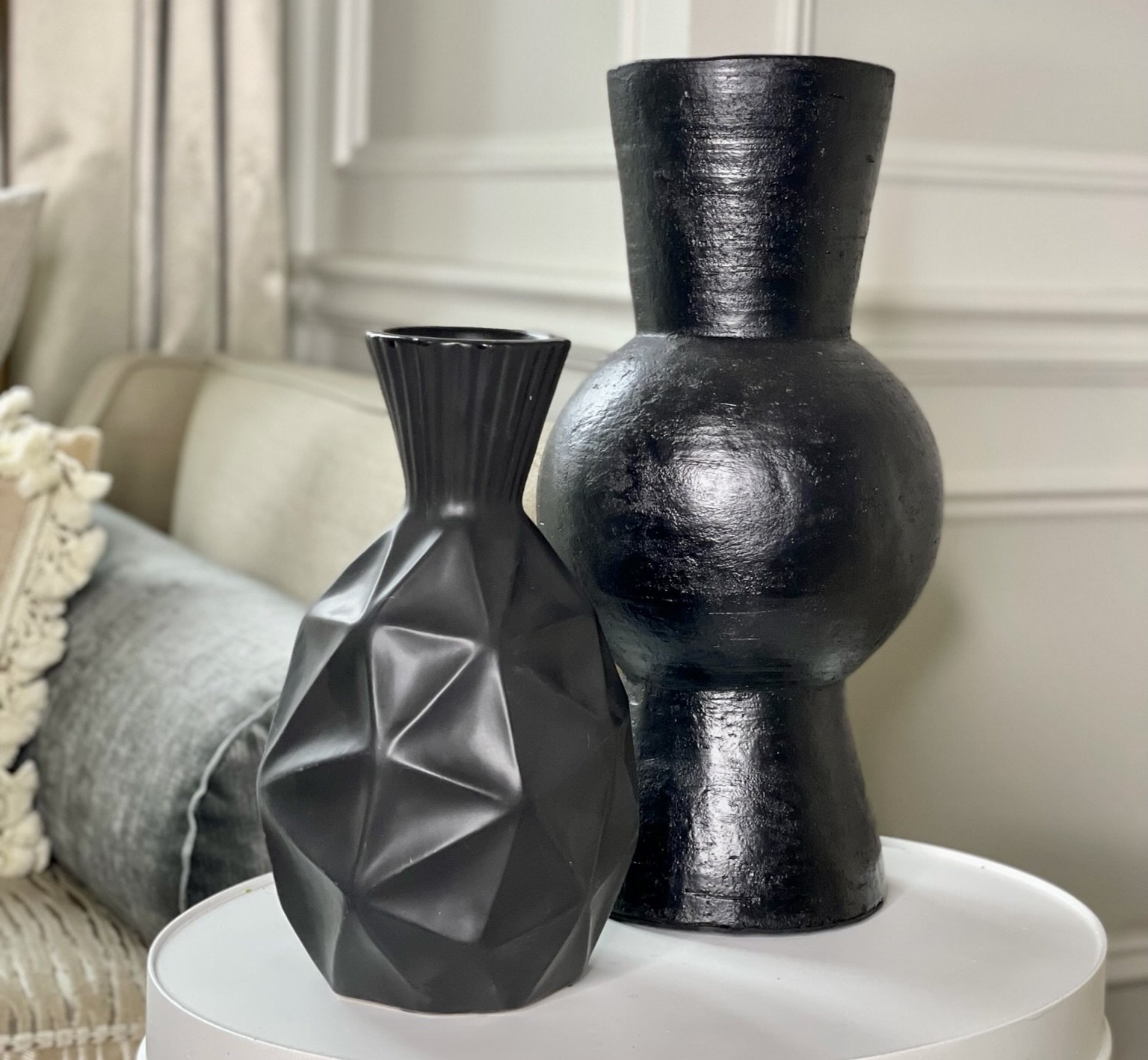
Storage and display are also important components of any family room. Determine if your budget allows for built-in storage or if you'll need to purchase a console beneath the TV with additional storage options. This will largely depend on your budget and available floor space.

Coffee tables should be chosen carefully as well, ideally 18 to 20 inches should be left between your couch and your table to ensure enough room for movement, while not being so far that one cannot put their feet up or reach for a snack or a converter from the table. Coffee table height will depend on your seating arrangement and how you use the table. A lower coffee table may be more appropriate for a contemporary space, while a higher table may be better for those who like to put their feet up. If you plan to play games or eat at the coffee table, consider a cocktail-height table.

From seating and lighting to carpet and tables, every element plays a role in creating a comfortable and inviting space for your family to gather. Take the time to carefully consider each element and invest in quality pieces that fit your style and budget. By doing so, you'll create a family room that you and your loved ones will enjoy for years to come.

Designing the perfect family room requires careful consideration of its function, focal points, seating, lighting, carpet, tables, and storage options. By prioritizing comfort, functionality, and style, you'll create a space that is inviting, cozy, and perfect for spending time with family and friends.

watch our full in depth video on YouTube.

2023 Interior Design Trends

Trend or Classic?

As many of you know, MMI does not do trendy interiors, our spaces are rooted in classic design, however, just like in fashion, adding in trends in small doses and understanding them helps keep us looking fresh, current, and adds a modern spin to classic design. This month we look at what’s trending for 2023 and I think many of you will be pleasantly surprised. Here are my top five favorites.

Wallpaper

Wallpaper is one of my favourite ways to add drama and excitement to a room. Wallpaper has been around for ages and has definitely gone in and out over the decades. The new way to use wallpaper however is so exciting yet for the most part, very classic. My favorite ways to use wallpapers are choosing ones that are more about texture than pattern, think silk or linen, faux or real. Another trend that has been around for a few years is over-scaled florals used especially in powder rooms. One area many people forget about is the ceiling and using wallpaper here brings in an incredible dynamic and interest that no other treatment can replicate. And the biggest trend in wallpaper is one that has been used for centuries; murals, soft and muted is my preferred palette for this look which adds not only beauty to your walls but also depth and dimension. 

Color Shift

We are moving away from all white or grey interiors and adding in warmth. Here at MMI, we are known for our greige color palette which is a very warm based grey, but the move now is to all beige rooms. For many of you who love your all white rooms or can’t change your mostly grey rooms the solution is simple…..for all white rooms, bring in warm wood tones and some natural stone materials in the forms of table or accessories, add a beige throw and some natural linen pillows. For those of you with grey rooms, do the same, travertine stone is a beautiful mix of beige and grey and beige mixes so easily with grey you’ll be surprised how easy it is to update your room.

Dark Moody Rooms

This one I love. Darker rooms are cozy and warm and envelope you in a way an all-white room can’t. The difference this year is we’re going all out dark; ceilings, trim, doors and cabinetry. To lighten up the look, for those of you who can’t envision committing to an all-dark room, add lighter toned furniture; for example light wood cabinets or tables in warmer tones, lighter palettes of upholstery and bedding, smoky or antiqued mirror accents to bounce the light around, and statement light fixtures to create real drama. Adding to the drama of this trend is the addition of our next trend……

Academia

If you’ve been watching Netflix’s Wednesday, you know the look I’m talking about. Academia brings in the warmer woods mentioned above and incorporates my favorite pastime: antiquing.  Warmer woods, distressed and pre-loved furniture, oil paintings, one of a kind accessories with history that help personalize the space, glass cloches highlighting an interesting collection of objects, vintage and recycled objects. A great way to incorporate this is to bring in some antique objects to mix with your more contemporary spaces. Mix clean lines with curves and carvings which are really hot. And this now leads to our next trend….. 

Built-In Cabinetry

If you follow me, you know this one is a staple for me and always has been. Built-ins are not an inexpensive option, however, they are a beautiful way of bringing luxury to a space while adding storage and display to a room, they also add character and weight to a space, making it feel like the space has history and permanence, that’s a lot of return for your initial investment. What makes this feel special is the introduction to a room of details, carvings, beautiful hardware, and a place to display your treasures and collections which further help to personalize your space and make it feel warm and welcoming.

Overall, the trends for 2023 is a move away from the more generic, contemporary open spaces we’ve been seeing to a more traditional feel and look. French country and English country elements are once again being seen in interiors and a look to the past is the new look for the future. For more trends, including the design feature I have always used in my projects, take a look at our You Tube channel. And remember, home is what makes you feel comfortable and just like in fashion, you need to pick and choose and incorporate only what works for you.

Watch our YouTube video on 2023 Interior Design Trends.

Drapery

Drapery Basics | What You NEED To Know

Drapery treatments are a critical component of interior design as they add texture, color, and style to a room. With the right approach, they can also control light and privacy making a space more livable and comfortable. One of the first steps in creating a successful drapery treatment is to choose the right type of treatment. The first question to ask yourself is am I looking for light control or privacy or is it just for aesthetics? If your answer is light control or privacy, blinds are a great option. Blinds are the first layer of a drapery treatment and are essential in setting the tone for the room. There are several types of blinds to choose from including roller blinds, silhouette blinds, cellular blinds, and shutters.

Choosing The Right Blinds

At MMI, we tend to work mainly with roller blinds and silhouettes as they can be budget-friendly and offer different light filtering options. Cellular blinds are an inexpensive option that falls in between roller blinds and silhouettes in terms of price, but they don't offer any light filtering options. We rarely use shutters as they block out all light and views and are bulky which detracts from the beauty of the room's windows.

When it comes to roller blinds, I recommend using them in areas like children's rooms (black out available) or main bathrooms where you need complete privacy but are looking for a budget friendly option. For the front of the house, I prefer to use silhouettes. They offer light filtering, light blockage if needed, and still provide a view while giving you complete privacy when needed. I consider silhouettes my favourite blinds and often use them as the starting point in building my layer of drapery treatments.

I love using Roman blinds to add depth and texture to a space. The difference between a faux Roman blind and a full Roman blind is that the former is non-functioning and purely decorative, while the latter provides full privacy and light blocking. Roman blinds are typically used as a layer in a window treatment, with a roller or silhouette blind as the base (if the roman blind is non-functioning), and/or paired with a treatment consisting of side panels. A soft roman blind has a dip in the center, while a straight Roman is more modern and masculine. When using a fabric Roman blind, there are three placement options: inside the window, outside the window, or on the casing if it is large and has a back bend. The placement and type of blind will depend on the budget and desired style.

Valences

Valances offer yet another layer, with hard valances being used for a more masculine look and soft valances for a feminine look.

Drapery Panels

Another important drapery decision is between side panels and full panels, the latter providing full closure and the former used primarily for aesthetics. When creating panels, we typically aim for a fullness of two and a half times the width of the window. Top treatments can greatly impact the final look of the drapery. Tab top and grommet are common and the least expensive, this is what you typically get in ready made drapery panels. I personally don’t like these because they offer no fullness or lushness, when drawn closed they are flat and when stacked they typically look like a shoestring just hanging. At MMI we prefer the Euro pinch pleat as it offers a more formal and contemporary look with ample fullness. Another option for modern spaces is the ripple fold, which I often incorporate into modern or contemporary spaces. Although it is a more expensive option due to the necessary hardware, it’s clean and beautiful look makes it a favourite. Another popular choice is the inverted box pleat, also known as flat panel, which offers a similar appearance at a lower cost.

Length is another consideration, with options ranging from hovering to puddling. MMI, we prefer the crisp break of a breaking length. The biggest mistake I see is curtains hung too short or not high enough on the wall. The type of lining used is also crucial in achieving the desired look and functionality of the draperies. A standard lining should be used to add bulk and prevent damage from the sun. A blackout lining is necessary for complete darkness or to further protect against sunlight from altering the fabric's color and damaging the fabric. Interlining, a third layer, offers thermal qualities and enhances the fullness of thinner fabrics. I personally like to choose a blackout lining that will not only offer protection from damage but helps the color and pattern of the fabric show true. Ultimately, the top treatment should complement the overall design of the space.

Pattern or plain? I love to incorporate patterns and color blocking in my drapery designs. When choosing patterns, it's important to keep in mind the size of the pattern as a larger pattern requires more fabric, which may result in waste and a higher price tag. My decision to use a pattern depends on the overall feel of the room, the other fabrics I'm using, and the customer's preference. One of my favorite techniques is color blocking, which i incorporated in a few recent projects. When looking for inspiration for your drapery treatment, don't forget to consider your furniture and other items in the room, remember the draperies should compliment the overall style and feel of the room.

In conclusion, drapery treatments are an essential aspect of interior design and can not only greatly enhance the look and feel of a room, but complete the overall design. With a little bit of knowledge and the right approach, you can create a beautiful and functional space that meets your needs and reflects your personal style.

Check out our YouTube video on Drapery here.

TOP TIPS FOR PAINT COLOR SELECTION

Tips for Paint Color Selection for your Home

The first step to choosing a paint color is deciding how the room is going to be used, at what time of day it gets used the most, and most importantly, what is the mood of the room. For example, if it's an office, you're not going to want a soothing or relaxing colour necessarily, instead, you're going to want something that gives you a little bit more energy. The same goes for a bedroom, there you're going to want a soothing color rather than a color that's very energetic. I sometimes see people painting bright yellow, bright green, or orange on bedroom walls, and I feel that that's not taking into consideration how that room is meant to be used, which is a space for us to calm down and relax. You may have heard from other designers that we do not like to come home to colour as we're surrounded by colour all day, when we come home at night, our own houses are generally very neutral so that we're coming into a soothing space. Color can make you energetic, it can make you chaotic, it can make you calm, it can make you happy, and it can even make you sad; so understanding the mood that you want to create for a room is incredibly important.

The 60-30-10 Rule

There's a design theory that many designers live by, which is the 60-30-10 rule. So what does that mean? Sixty percent of the room will be a dominant color, 30% of the room will be a supporting color to the base color, and then 10% is something thrown in there that's a little unexpected, a little bit against the grain, so it makes the room pop and gives that layer of life to the room so that it doesn’t appear flat.

The Energy of a Color

All colors have an energy that they bring to the room. White is associated with sterile, pure, and cold, while black is often seen as overpowering, dark, and heavy. Green is associated with nature, vibrancy, and newness, while blue is calming and is often associated with the sky.

The undertones of a color are important to consider when selecting a paint color. White and neutral colors often have many shades, but each shade has an undertone. The bottom of the color chip from a paint supplier is where you can find the undertone of a color. The same color throughout with more white added is a cool undertone, while the same color throughout with more yellow added is a warm undertone. A good way to see the undertone is to put a paint chip against a piece of white paper and you should be able to see the undertone as well as if the color is cool or warm.

When selecting a paint color, it's important to look at the color chip in different lights. Natural light is the best way to see the true color of a paint, so take the color chip outside and hold it up to the sky. Artificial light can also change the way a color looks, so hold the color chip up to different types of artificial light to see how it looks.

The Effects of Natural & Artificial Light

Depending on your location, geographically you're going to get different quality of lights. Even if you're in an east-facing room here in Toronto, versus, for example, an east-facing room in Florida, the same east-facing window will have a different quality light coming through. What's directly outside the window will also affect that. For example, if you have a lot of green outside the window, the light is going to be reflected off of the greens and that's what's coming through your window. If you've got a red brick wall next to your window, the light is going to reflect off of that red brick and it’s going to affect how the color looks on your walls. That's why you may have heard that a color can look one way during the day and another way at night. This is because of the difference between how the natural light looks or reflects off of that paint color versus how artificial light in the evening reflects off of that wall. A general rule of thumb is the lighter the color, the more the reflective quality is going to be so you're going to get more light bouncing off of that color than you will on the more saturated colors, which will absorb more of that light.

Creating a Cohesive Room with Color and Light

To create the appearance of a larger space, I like to use one color on all surfaces and take the color up to the ceiling. This creates a cohesive look and can make the ceiling appear higher. I also use the same color on the trim and baseboards to create a seamless look however I play with different sheens to add interest and to create a cohesive look. For example, I use a washable flat on the walls, a flat or lacquered finish on the ceiling, and a semi-gloss on the trim.

When choosing a color for a room, I like to start with a piece of fabric or art that I love and build the color scheme around it. This helps to set the mood for the room and ensures that the colors complement each other. I avoid using a single color as a feature wall, as I find this can look dated. Instead, I prefer to use an architectural feature or wallpaper with a pattern that ties in with the rest of the room.

In general, when staging a home, I like to use neutral colors. This allows the focus to be on the flooring and other architectural features of the room. It's important to consider the undertones of the flooring when selecting a paint color, as this can affect the overall look of the space.

In conclusion, choosing the right paint color for a room involves considering multiple factors, including the intended use of the room, the time of day it is used most, and the desired mood. The 60-30-10 rule can be a helpful guideline for selecting a dominant, supporting, and accent color. It is also important to consider the undertones of color and how the amount and quality of natural light in the room can affect its appearance. By understanding these factors and using them to guide your color selection, you can create a space that is both functional and visually appealing. For some of my favourite paint colors, be sure to watch our video on YouTube.

Watch our YouTube video on Paint Color Selection.

CARPETS/RUGS

Tips for Finding the Perfect Carpet/Rug for your Home

There's a lot to consider when buying a new carpet and it can feel overwhelming. Taking your time, doing the proper research, and finding the right retailer will make the job manageable and enable you to select a carpet you'll be happy to live with for years to come. I’d like to share with you a few tips to make this process easier and that will help you find the perfect carpet for your home!

1. Understand your Design Style

The first thing you should do is try to understand your design style. Decide on a style that works for both your aesthetics as well as your needs. While there are hundreds of carpets available, they can all be narrowed down into one of only a few style categories. These styles may include modern, traditional, bohemian, or contemporary. For example, with a more modern style, you may want to look for a striped or graphic rug. For a traditional style, a vintage or Persian rug would compliment your style beautifully. In addition, in order to create a space that is cohesive and well thought out, come up with a colour theme and choose rugs that fall into those hues. This can be done by repeating patterns and colours you have in other areas of the home to create a flow from room to room. For a warm palette, consider earth tones, desert hues, dusty pinks, golds, and burnt oranges. For a cool palette, consider shades of grey, blue, or green.

2. Material

There are many types of materials out there so I have broken down the most common materials to give you a better understanding of which one fits your needs. These materials include wool, silk, jute, seagrass, sisal, polyester, synthetic, and animal hide.

Natural Materials (Wool and Silk)

  • Wool and Silk rugs are a great way to add comfort, luxe and softness to your home. This rug material works well in bedrooms and living rooms as it’s soft enough to walk around barefoot.

  • Wool and Silk rugs are durable, which means they’ll last for a while, usually an average of 20 to 30 years. Keep in mind that your rug’s lifespan will vary based on how well you maintain it.

  • On the downside, wool and silk rugs are not great for damp areas, such as mudrooms or patios because they tend to hold moisture which will damage the rug.

  • One more downside is that these rugs can be very expensive.

Natural Materials (Jute, Seagrass, Sisal)

  • Natural material rugs are natural-fiber rugs chosen for the texture and casualness they bring to a room.

  • Jute rugs are static-free and absorbent however dampness and moisture can be hazardous to jute. Natural fibres like jute tend to collect dust, which reduces the amount of dust particles floating in the air, however need plenty of vacuuming.

  • Sisal rugs are an excellent choice for almost any room in your home. Sisal fibres are durable, tightly resistant to abrasion and stains and have a beautifully textured feel.

  • Seagrass rugs are the the least expensive option of the natural material rugs however they only come in one color.

  • Seagrass is best used in a low humidity environment as it is susceptible to mold and mildew.

  • Seagrass is extremely resistant to staining.

  • Sisal is the most popular of the natural fibre rugs, it is durable and has a muted, organic beauty that blends with many design styles.

  • Sisal fibres dye well resulting in a range of natural shades and come in a variety of patterns.

  • Sisal can be rough on the feet and are not good for areas that can become wet.

Polyester

  • Polyester is a non-absorbent and fast-drying material, which means that it is far less prone to mildew and mold. Due to the way it is dyed it’s also resistant to most chemicals, as well as any fading from UV rays. This makes polyester a great option for those looking for a rug that is going to stand the test of time.

  • Polyester is inexpensive, soft, and comes in a wide range of colours.

Synthetic

  • Synthetic materials are great for outdoor rugs because they don’t fade when placed in direct sunlight. These rugs are easy to maintain because you can clean them by simply tossing them into the washing machine or hosing them down.

  • They are made to be stain and wear resistant, making them good for high traffic areas.

Animal Hides

  • Animal hides give a luxurious look to any space.

  • Animal hide rugs go with any style home and are very durable.

  • Animal skin rugs can add a modern element to a very formal stuffy setting. The textural differences of a patterned cow skin creates a pleasant contrast to synthetic fabrics.

  • Animal hide rugs come in a variety of price points and can be made into area rugs by piecing cut strips or squares together.

  • Animal hides are not good for areas that are prone to wetness.

3. Size

The size of an area rug can dramatically alter the room's overall look. A rug that is too small for your space can visually shrink the room and cause the room to feel uninviting. A rug that is too large for the room can, paradoxically, make the room feel smaller. It's often recommended to decide on the appropriate size of rug based on your furniture configuration, not based on the specific room size. You want to get a rug that’s big enough to accommodate furniture but not too big to bump into the edges of the walls, leaving at least a 6-12 inch border of floor showing. To determine the length of the rug in a bedroom, you should measure 4-6 inches in front of your nightstands to at least 3’ in front of the bed or a bench if you have one. The width should be determined by measuring from one end of your nightstand to the other. For dining rooms, the rug should fit all chairs and dining table so that when pulling out the chair, it should still be on the rug.

4. Colour/Patterns

The carpet color can alter the entire feel of a room, so be sure to select your color carefully and wisely. Think about how trends may change over the years, and be sure that the color you love today will still appeal to you down the road. If you already have furniture, consider how different colors will work with your existing items. Rooms with a lot of color and pattern often work best with a rug that has neutral tones or a single color. If you don't already have furnishings, consider how different rug colors will work with the tones of the flooring, walls, and ceiling. Rugs can either stand out or blend in, so think about what effect you want to create when considering colour. Look to colour to create a mood in your space (light and bright or a dark and moody space). For a classic look that never goes out of style, stay away from too trendy patterns (a piece that never gets dated is vintage Persian rugs).

Watch our YouTube video on selecting your next carpet/rug.

FLOORING

How to Choose the Right Flooring For Your Home

Choosing flooring is far more complicated than just finding the best-looking product. Several other factors—moisture, durability, costs, and more—greatly influence the decision. Since the floor is usually the largest surface in a room, it lays the foundation for the entire look of the space—color, style, texture, and pattern. Your floor choice is about balancing your needs with your style. Here are 3 things to consider before picking your flooring.

What is the primary use of the area where the flooring is being installed?

The first thing you want to consider is the function of the room where the flooring is being installed. Is the flooring for a bathroom, kitchen, bedroom or living room? With this information, you can now decide whether the flooring needs to be suited for a high to medium-moisture environment. If this is the case, you know you must select a product such as concrete, stone, ceramic or porcelain tile, or vinyl tile.

Do you need low-maintenance flooring?

It is important to choose the flooring that is going to meet your current needs: If having low-maintenance flooring is important, consider any form of resilient (vinyl) flooring such as tile or plank which are water-resistant and easy to clean. Laminate flooring is a close second choice only because it needs special cleaning methods since wet mops can ruin it.

What is your budget?

Calculate your budget. Keep in mind that along with the cost of the floor material, you may need to incorporate the cost of underlayment, delivery, and installation, as well as removal and disposal of your previous flooring. Don't forget to factor in any additional materials such as baseboards, stains, grout or adhesives.

Types of Flooring

There are so many types of flooring out there that it can be confusing to decide which one is right for you. Here are some of the most popular types of flooring and the advantages and disadvantages of each.

Solid Hardwood

Solid Hardwood

Advantages

  • Durable and elegant looking

  • Easy to maintain: vacuum and damp mop

  • Long-lasting and helps to increase your home’s resale value

Disadvantages

  • Hardwood flooring can be expensive to buy and install and can damage easily

  • Moisture will ruin hardwood if not tended to immediately

  • Hardwood also needs to be refinished occasionally


Engineered Hardwood

Engineered Hardwood

Advantages

  • Engineered wood is more stable than hardwood while offering the exact same appearance

  • This type of flooring is used by creating a thick base layer of plywood and then adding a thin veneer of real wood on top. Because it’s not hardwood all the way through, it’s not susceptible to expanding and contracting due to changes in humidity

Disadvantages

  • Engineered wood can still take a beating over time and can still scratch and dent

  • It can only be refinished a couple of times since that top layer is so thin, which eventually means you’ll have to replace it if and when damage occurs

  • Not waterproof

  • Expensive to buy and install

  • Helps increase your home’s resale value


Vinyl Plank

Vinyl Plank

Advantages

  • You’ve got a variety of options when it comes to vinyl, which allows you to work this option into a lot of budgets

  • With today’s luxury vinyl, you get a much more expensive-looking result for a relatively cheap price

  • Great for areas that are susceptible to water, therefore can be used in bathrooms and kitchens or mudrooms

Disadvantages

  • All flooring options have a lifespan, with vinyl’s being a bit lower than that of wood and tile

  • It’s also produced with petroleum, which means it’s not as sustainable or environmentally-friendly as other types of flooring

  • It’s not real wood so it lacks warmth and resale value


Laminate

Laminate

Advantages

  • Laminate is relatively inexpensive to purchase and have professionally installed, and can be adapted to give the appearance of a wide range of flooring options

  • It’s also quite durable, and is more resistant than many other materials to things like pets, kids, and shoes

Disadvantages

  • The plywood or fibreboard used to make laminate flooring is prone to water damage, and since it can be hard to repair, you’ll almost certainly have to completely replace the laminate in an area where there’s been any sort of standing water

  • Has a hollow sound

  • Lacks resale value


Tiles

Tile (ceramic/porcelain)

Advantages

  • Ceramic tile is incredibly versatile in appearance. It’s also easy to clean and quite durable

  • Ceramic tile is inexpensive to purchase

  • Porcelain tiles are dense, they are highly impervious to most substances and stains don’t have the chance to seep down in and set.

  • Porcelain tile can range from low to high to purchase and cost more than ceramic to lay

  • Porcelain tile can be used outdoors

  • Porcelain tile has its color go right through so chips are harder to detect

  • Porcelain tile combines the beauty and hardness of natural stone but it costs less and it's easier to maintain

Disadvantages

  • Ceramic tile is also a hard material so it’s not quite as comfortable to walk on as other flooring options

  • Ceramic tile is more dated looking in most of its color and patterns, grout lines are usually larger in a ceramic tile installation and therefore prone to look dirty faster

  • Ceramic tile has color only on the top and therefore chips easily and shows wear and tear very quickly

  • Even though porcelain tile is easy to maintain on its own, you need to consider the maintenance that grout adds to the equation. Grout is the filler material that must be used in between tiles for a good water-resistant installation

  • Even though porcelain tile is easy to maintain on its own, you need to consider the maintenance that grout adds to the equation. Grout is the filler material that must be used in between tiles for a good water-resistant installation

Porcelain Tile

Color goes right through

Ceramic Tile

Color sits on top


Natural Stone Tile

Natural Stone Tile

Advantages

  • Natural stone, such as granite, marble, travertine and sandstone, are popular flooring choices for both indoor and outdoor spaces

  • A natural stone floor provides a hard-wearing, easy to clean and maintain, durable floor covering

  • They won’t be susceptible to breaking or staining, giving you one less thing to worry about

  • A simple wipe down with a cloth or mop is all that is needed to remove any spills, no scrubbing or special cleaning products required

Disadvantages

  • Natural stone tiles can be very expensive

  • Natural stone are porous and as such has to be regularly treated with a sealing agent to prevent water damage or staining

Watch our full flooring video on YouTube where we talk in depth about flooring including how installation affects the overall cost.

FAUX FLORALS

Tips for Using Faux/Artificial Florals in Your Home

As most of you know, flowers are a passion of mine. That said, no matter where one lives, having a garden to cut one’s own fresh flowers is not always possible & replacing flowers on a weekly basis can be cost prohibitive for most. So what’s a flower lover to do when they want to be surrounded by flowers? For me, the answer is going faux, but like with most things, not all faux are created equal. We’re going to look at some of my tips and tricks for selecting the freshest faux florals for the most realistic look.

6 Ways to Make Faux Plants Look More Realistic

  1. Fluff the branches

  2. Find a unique vase

  3. Put filler in the pot to stabilize the plant: floral foam (only if the vessel is opaque) rocks or sand

  4. Cut branches so that florals are 2x the height of the vessel. (e.g. vessel is 12” high, florals should be 30” to 36” in overall height)

  5. Use stems in abundance so that the florals support themselves and help mimic the abundance found in nature

  6. Vary the heights of the stems in the vessel

    Bonus Tip: silk with wire in stem and leaves give a more realistic look

DANCING ORCHID SPRAY

Adding a touch of real, natural components to the base of a faux plant is one of the simplest and fastest methods to improve it. Using natural branches, sand, rocks, or moss will provide a hint of natural realism to your artificial plant while also creating a sense of organic texture.

FAUX THISTLE BUSH

A faux plant’s most recognizable flaw is looking far too perfect. Bring some realism to the table by shaping stems and leaves to slightly droop and follow a less uniform “growth pattern.”

FAUX APPLE BLOSSOMS

Clean your plants! Dust loves plants, so this tip should apply to all of your plants, even the real ones. The thing is, real plants get watered and misted so the dust isn’t as big of a problem. This means a dusty faux plant is an obvious imposter. Use a blow dryer to blast dust off.

FAUX PINK CHERRY BLOSSOM & DOGWOOD BLOSSOM

If you're still skeptical about displaying an artificial plant in your home, why not ease into it by mixing it in with other, complementary real plants? Not only will this conjure an environment of real-life plants collectively, but it will also make your artificial plant harder to spot.

FAUX YELLOW DANCING ORCHID SPRAY

Fluff the plant. Begin at the bottom by carefully pulling each section/tier, each branch is flexible and can be shaped one by one. Once the branches are separate, start separating the branches from the base, this is known as "fluffing." How to make artificial plant leaves look real: Work down the leaves by creating a slight curve; this will make the leaves more lifelike. Continue this process throughout, and remember to always start from bottom to top.

What to Look for When Purchasing

So what do I look for when purchasing faux flowers? Making a statement when using faux comes down to the same thing when creating the same luxurious space, it’s all about the details!

  1. Real feel silk flowers are the gold standard of faux, they not only look and feel real but they react to touch as if they were real.

  2. An important detail of faux is if there is wire in the stem, so you can bend and manipulate it like a real flower, this will include the leaves.

  3. Selecting color is another important element in making your faux flowers look real, if it doesn’t grow that color in nature, do not include it in your selection.

  4. Limit the number of species of flowers to three but feel free to include greenery in addition to that number.

  5. Do not mix flowers from different growing seasons in one arrangement, this is the quickest way for your arrangement to scream “faux”.

  6. Display your faux flowers only in their growing season and then switch out to another selection from the current growing season.

Speaking of the stem, does it look realistic? If the flower grows on a wooded branch, the stem of your faux should be brown to simulate a wood look and if the flower in nature is growing on a green stem, then your faux’s stem should follow suit. Treat your faux flowers like you would a real flower.

Vases in Your Home

The finishing touch to any interior space is your decor. Even the most beautifully designed homes appear lifeless without hand-picked decorative elements that capture your attention and give the space a pop of personality. Vases are one of the easiest and most satisfying ways to amp up the style quotient of any room. From bringing the outdoors in with fresh flowers and greenery or wanting to wow your guests, we never underestimate the decorative punch of a new vase. Vases showcase anything from beautiful floral arrangements to a few branches. They also add visual and touchable texture to a space and are a great way to bring in sculptural interest. There are so many colorful vases for sale but using your room’s overall colour palette should guide you. If your overall palette is neutral, ceramic vases in soft pastel hues or in natural colours might be a good choice. From contemporary to architectural, here are a few of my favorites (click on photo to be brought to product page on www.mycuratedinterior.com).

CREAM SCULPTURAL VASES

COLOURED GLASS VASE

BLACK VASES

GOLD TEXTURED VASE

If you haven’t already seen our full YouTube video discussing faux florals, check it out here.

LIGHTING

DESIGN 101

Lighting and Light Fixtures: How to Properly Light a Room

Here's how we go about lighting a room: first question... Ask yourself how the room is being used and at what time of day: work --- this dictates a brighter, cooler temperature light in order to keep you alert and active. Also consider this type of light in an office, bathroom, or kitchen relaxing --- this dictates a dimmer, warmer temperature light in order to help you relax. This light is best used in rooms used in the evening such as a family room or bedroom.

TYPES OF BULBS

INCANDESCENT - Last 100 years

DISCHARGE LIGHTS - Last 20 years

LED - Latest


HOW TO CALCULATE LIGHT WATTAGE NEEDED IN A SPACE

The amount of light output is calculated in lumens…

  • Higher lumens ---- brighter light

  • Cooler colours make us more active and increase our alertness

  • Colour temperatures range from 1800-6000 kelvin 3000 - most common is 3000-4000 for warm and 4500-5000 for cool light

  • The Colour Rendering Index is how the quality of light allows us to see colour

In my studio, I have 95 CRI in order to see the true colours of fabrics. For areas in your home, you may want to use this where you do your make-up or for an art studio space.


TYPES OF OVERHEAD LIGHTING

An example of a diffused or ambient light which creates soft shadows and a glow is a bedside table or dining table chandelier.

Examples of a harsh light which creates hard shadows are narrow, spot or flood lights. These are best used when highlighting sculpture or architectural details


TYPE OF LIGHT NEEDED FOR FUNCTION OF ROOM

  • COOKING: TASK & OVERHEAD

  • READING: TASK

  • RELAXING: ACCENT

  • WORKING: TASK & OVERHEAD

  • EXERCISING: OVERHEAD

  • TV WATCHING: AMBIENT & ACCENT

REMEMBER TO LIGHT WITH A MINIMUM OF 3 LAYERS

  1. Ambient

  2. Task

  3. Accent

TYPES OF OVERHEAD LIGHTING

  • Spot

  • Floodlight

  • Ambient light


HOW TO CALCULATE THE SIZE OF A CHANDELIER

  • Room Size 10’ wide x 12’ long

    add your dimensions in inches (width plus length) 10 + 12 = 22” optimal size

  • Table size 48” round

    take your overall size in inches, subtract 6” to 8” for each side (two sides) 48” - (6“ x 2) = 36” or 48” - (8” x 2) = 32” which gives optimal size of 32” to 36”

  • Table size 48” wide x 84” length

    use the width of table (using same formula for a round table) to determine size if using a round or square fixture


HOW TO CALCULATE THE HANG HEIGHT BASED ON A 8’ CEILING

  • Measurement of fixture above a dining table: 34” to 36” from top of table to bottom of chandelier, add 4” to 6“ for every 1’ of additional ceiling height

  • Measurement of fixture above an island: 39” to 42” from top of island to bottom of chandelier or pendant, add 4” to 6” for every 1’ of additional ceiling height

  • Measurement of fixture at ceiling height: minimum 84” from floor to bottom of fixture

  • Measurement of vanity sconce: ideally fixture should be 84” above finished floor for typical sconce centred above vanity sink

  • Measurement of sconces used for accent lighting: ideally sconces should be at approx. 69” above finished floor regardless of ceiling height

Check out our YouTube video for more visual aids when deciding which types of lighting to use.