

TOP TIPS FOR PAINT COLOR SELECTION
/Tips for Paint Color Selection for your Home
The first step to choosing a paint color is deciding how the room is going to be used, at what time of day it gets used the most, and most importantly, what is the mood of the room. For example, if it's an office, you're not going to want a soothing or relaxing colour necessarily, instead, you're going to want something that gives you a little bit more energy. The same goes for a bedroom, there you're going to want a soothing color rather than a color that's very energetic. I sometimes see people painting bright yellow, bright green, or orange on bedroom walls, and I feel that that's not taking into consideration how that room is meant to be used, which is a space for us to calm down and relax. You may have heard from other designers that we do not like to come home to colour as we're surrounded by colour all day, when we come home at night, our own houses are generally very neutral so that we're coming into a soothing space. Color can make you energetic, it can make you chaotic, it can make you calm, it can make you happy, and it can even make you sad; so understanding the mood that you want to create for a room is incredibly important.
The 60-30-10 Rule
There's a design theory that many designers live by, which is the 60-30-10 rule. So what does that mean? Sixty percent of the room will be a dominant color, 30% of the room will be a supporting color to the base color, and then 10% is something thrown in there that's a little unexpected, a little bit against the grain, so it makes the room pop and gives that layer of life to the room so that it doesn’t appear flat.

The Energy of a Color
All colors have an energy that they bring to the room. White is associated with sterile, pure, and cold, while black is often seen as overpowering, dark, and heavy. Green is associated with nature, vibrancy, and newness, while blue is calming and is often associated with the sky.
The undertones of a color are important to consider when selecting a paint color. White and neutral colors often have many shades, but each shade has an undertone. The bottom of the color chip from a paint supplier is where you can find the undertone of a color. The same color throughout with more white added is a cool undertone, while the same color throughout with more yellow added is a warm undertone. A good way to see the undertone is to put a paint chip against a piece of white paper and you should be able to see the undertone as well as if the color is cool or warm.
When selecting a paint color, it's important to look at the color chip in different lights. Natural light is the best way to see the true color of a paint, so take the color chip outside and hold it up to the sky. Artificial light can also change the way a color looks, so hold the color chip up to different types of artificial light to see how it looks.

The Effects of Natural & Artificial Light
Depending on your location, geographically you're going to get different quality of lights. Even if you're in an east-facing room here in Toronto, versus, for example, an east-facing room in Florida, the same east-facing window will have a different quality light coming through. What's directly outside the window will also affect that. For example, if you have a lot of green outside the window, the light is going to be reflected off of the greens and that's what's coming through your window. If you've got a red brick wall next to your window, the light is going to reflect off of that red brick and it’s going to affect how the color looks on your walls. That's why you may have heard that a color can look one way during the day and another way at night. This is because of the difference between how the natural light looks or reflects off of that paint color versus how artificial light in the evening reflects off of that wall. A general rule of thumb is the lighter the color, the more the reflective quality is going to be so you're going to get more light bouncing off of that color than you will on the more saturated colors, which will absorb more of that light.

Creating a Cohesive Room with Color and Light
To create the appearance of a larger space, I like to use one color on all surfaces and take the color up to the ceiling. This creates a cohesive look and can make the ceiling appear higher. I also use the same color on the trim and baseboards to create a seamless look however I play with different sheens to add interest and to create a cohesive look. For example, I use a washable flat on the walls, a flat or lacquered finish on the ceiling, and a semi-gloss on the trim.
When choosing a color for a room, I like to start with a piece of fabric or art that I love and build the color scheme around it. This helps to set the mood for the room and ensures that the colors complement each other. I avoid using a single color as a feature wall, as I find this can look dated. Instead, I prefer to use an architectural feature or wallpaper with a pattern that ties in with the rest of the room.
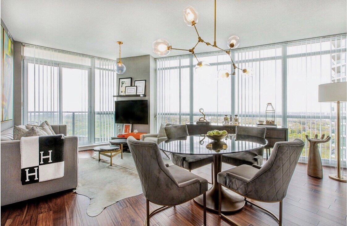
In general, when staging a home, I like to use neutral colors. This allows the focus to be on the flooring and other architectural features of the room. It's important to consider the undertones of the flooring when selecting a paint color, as this can affect the overall look of the space.

In conclusion, choosing the right paint color for a room involves considering multiple factors, including the intended use of the room, the time of day it is used most, and the desired mood. The 60-30-10 rule can be a helpful guideline for selecting a dominant, supporting, and accent color. It is also important to consider the undertones of color and how the amount and quality of natural light in the room can affect its appearance. By understanding these factors and using them to guide your color selection, you can create a space that is both functional and visually appealing. For some of my favourite paint colors, be sure to watch our video on YouTube.
Watch our YouTube video on Paint Color Selection.